Row Widget In Flutter – A Short Guide

Row Widget In Flutter – A Short Guide

Row Widget In Flutter – A Short Guide
Published At By Hupen Pun

The Row widget in Flutter is a flexible layout widget that is used to arrange child widgets horizontally. It is one of the most basic and commonly used widgets in Flutter and is an essential tool for building responsive and attractive user interfaces. In this blog post, we will explore the basics of using the Row widget in Flutter and show you how to create and customize it for your app.

To create a Row widget in Flutter, simply wrap the child widgets you want to display in a Row widget. For example:

Row(
  children: [
    Text('Row Item 1'),
    Text('Row Item 2'),
    Text('Row Item 3'),
  ],
)

In the above example, we are creating a Row widget with three child Text widgets. The child widgets will be displayed horizontally, one after the other.

The Row widget provides several properties that you can use to customize its appearance and behavior. For example, you can use the mainAxisAlignment property to control the alignment of the child widgets in the main axis. For example:

Row(
  mainAxisAlignment: MainAxisAlignment.spaceBetween,
  children: [
    Text('Row Item 1'),
    Text('Row Item 2'),
    Text('Row Item 3'),
  ],
)

In the above example, we are using the mainAxisAlignment property to distribute the space evenly between the child widgets in the main axis.

You can also use the crossAxisAlignment property to control the alignment of the child widgets in the cross axis. For example:

Row(
  crossAxisAlignment: CrossAxisAlignment.center,
  children: [
    Text('Row Item 1'),
    Text('Row Item 2'),
    Text('Row Item 3'),
  ],
)

In the above example, we are using the crossAxisAlignment property to center the child widgets in the cross-axis.

In conclusion, the Row widget in Flutter is a simple and flexible layout widget that is essential for building responsive and attractive user interfaces. With the ability to customize its appearance and behavior, it makes it a great option for creating engaging and interactive experiences in your app.

You can have in detail information on the Row widget in this official Flutter Channel.

A Quick Guide To Snack Bar In Flutter – Hupen Design

A Quick Guide To Snack Bar In Flutter – Hupen Design

A Quick Guide To Snack Bar In Flutter – Hupen Design
Published At By Hupen Pun

Snackbars are a lightweight and convenient way to provide feedback to users in Flutter. They are short messages that appear at the bottom of the screen and disappear automatically after a short duration. Snackbars are used to show short, non-interruptive, and temporary messages.

To create a snackbar in Flutter, you need to import the Scaffold widget from the flutter material library and use the Scaffold.of method to access the nearest scaffold in the widget tree.

Here’s how you can create a basic snackbar in Flutter:

void showSnackbar(BuildContext context, String message) {
  Scaffold.of(context).showSnackBar(
    SnackBar(
      content: Text(message),
    ),
  );
}

In this code, we import the Material library and then create a function named showSnackbar that takes in a BuildContext and a String message as its parameters. In the function body, we use the Scaffold.of method to access the nearest scaffold and call the showSnackBar method on it. We pass in a SnackBar widget that contains a Text widget with the message passed in as its content.

You can call this function anywhere in your Flutter code to show a snackbar with the given message.

The SnackBar widget also accepts a few optional properties, such as:

The SnackBar widget also accepts a few optional properties, such as:

  • duration: The amount of time the snackbar should be displayed on the screen before disappearing.
  • backgroundColor: The background color of the snackbar.
  • action: A button that the user can press to take an action related to the snackbar message.

Here’s an example of how to use these properties:

Scaffold.of(context).showSnackBar(
  SnackBar(
    duration: Duration(seconds: 2),
    backgroundColor: Colors.blue,
    content: Text(message),
    action: SnackBarAction(
      label: 'Undo',
      onPressed: () {
        // Do something when the user presses the undo button
      },
    ),
  ),
);

In this example, we set the duration to 2 seconds, the backgroundColor to blue, and include an action with a label of “Undo” and an onPressed callback that will be triggered when the user presses the undo button.

Snackbars are a great way to provide feedback to users in a non-intrusive manner. They are easy to implement and customize, making them a popular choice for many Flutter developers.

You can have in detail information on the SnackBar widget in this official Flutter Widget Of The Week from Google Flutter Team.

A Quick Guide To Dialog Box In Flutter – Hupen Design

A Quick Guide To Dialog Box In Flutter – Hupen Design

A Quick Guide To Dialog Box In Flutter – Hupen Design
Published At By Hupen Pun

Dialog Box is a commonly used UI component in Flutter that is used to display important information or prompts to the user. It is a pop-up window that appears on top of the current screen and requires the user to take some action. In this blog post, we will explore the basics of using AlertDialog in Flutter and show you how to create and customize it for your app.

The first step in creating an AlertDialog in Flutter is to call the showDialog function, which takes a context argument and a builder function that returns the AlertDialog widget. For example:

showDialog(
  context: context,
  builder: (BuildContext context) {
    return AlertDialog(
      title: Text('Alert Dialog Title'),
      content: Text('This is the content of the alert dialog'),
      actions: [
        FlatButton(
          child: Text('OK'),
          onPressed: () {
            Navigator.of(context).pop();
          },
        ),
      ],
    );
  },
);

In the above example, we are creating an AlertDialog with a title, content, and an action. The actions property is used to specify the buttons that will be displayed at the bottom of the alert dialog. You can add as many actions as you like, but it is recommended to limit the number of actions to two.

You can also customize the appearance of the AlertDialog by changing its title, content, backgroundColor, and other properties. For example:

AlertDialog(
  title: Text('Alert Dialog Title'),
  content: Text('This is the content of the alert dialog'),
  backgroundColor: Colors.blue,
  shape: RoundedRectangleBorder(
    borderRadius: BorderRadius.circular(10.0),
  ),
  actions: [
    FlatButton(
      child: Text('OK'),
      onPressed: () {
        Navigator.of(context).pop();
      },
    ),
  ],
);

In the above example, we are changing the background color of the AlertDialog to blue and giving it a rounded rectangle border with a 10.0 radius.

In conclusion, AlertDialog is a useful UI component in Flutter that allows you to display important information or prompts to the user. With the ability to customize its appearance and behavior, it makes it a great option for creating engaging and interactive experiences in your app.

You can have in detail information on the GridView widget in this official Flutter Widget Of The Week from Google Flutter Team.

A Quick Guide to Grid View In Flutter – Hupen Design

A Quick Guide to Grid View In Flutter – Hupen Design

A Quick Guide to Grid View In Flutter – Hupen Design
Published At By Hupen Pun

Grid View in Flutter is a powerful way to create a visually appealing and interactive layout for your app. With the GridView widget, you can easily create a grid layout and populate it with widgets, images, or other elements. In this blog post, we will explore the basics of using GridView in Flutter and show you how to create a simple grid layout for your app.

The first step in creating a GridView in Flutter is to add the GridView widget to your app’s layout. You can do this by using the child property of the Container widget. For example:

Container(
  child: GridView.count(
    crossAxisCount: 2,
    children: [
      Container(
        color: Colors.red,
        child: Text('Item 1'),
      ),
      Container(
        color: Colors.green,
        child: Text('Item 2'),
      ),
      Container(
        color: Colors.blue,
        child: Text('Item 3'),
      ),
    ],
  ),
)

In the above example, we are using the GridView.count constructor to create a grid layout with 2 columns. The children property is used to specify the widgets that will be displayed in the grid.

Another important property of the GridView widget is the crossAxisCount property, which specifies the number of columns in the grid. You can also use the mainAxisSpacing and crossAxisSpacing properties to add spacing between the items in the grid.

Additionally, GridView allows to use .builder constructor in order to build the grid on demand, which is useful when dealing with large data sets.

GridView.builder(
    itemCount: 100,
    gridDelegate: SliverGridDelegateWithFixedCrossAxisCount(
        crossAxisCount: 2),
    itemBuilder: (BuildContext context, int index) {
      return Container(
        color: Colors.red,
        child: Text('Item $index'),
      );
    },
  ),

In the above example, we are using the GridView.builder constructor to create a grid layout with 100 items. The itemBuilder callback is used to generate the widgets that will be displayed in the grid.

In conclusion, GridView in Flutter is a powerful and flexible way to create grid layouts for your app. With the ability to control the number of columns, spacing, and the ability to build grid on demand, it makes it a great option for creating visually appealing and interactive layouts.

You can have in detail information on the GridView widget in this official Flutter Widget Of The Week from Google Flutter Team.

Background Mask And Background Pattern For Divi

Background Mask And Background Pattern For Divi

Background Mask And Background Pattern For Divi
Published At By Hupen Pun

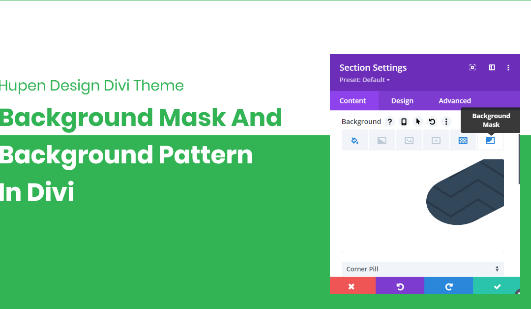
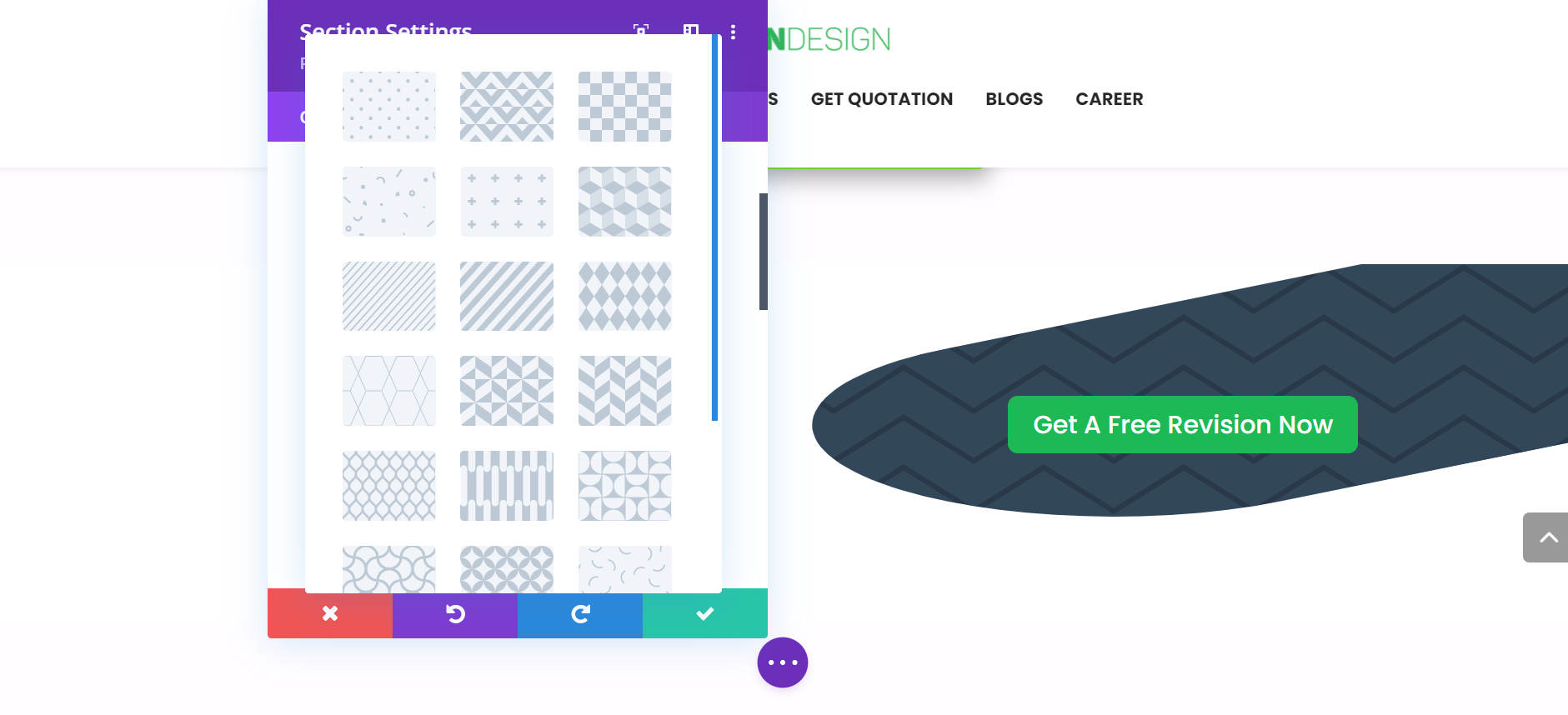
Divi is the most popular visual drag and drop website builder for WordPress. It is developed and maintained by Elegant Themes. With Divi, you can build beautiful, powerful, and eye-catching websites. With the version of 4.15.0 Divi has brought the most powerful features like Background Pattern and Background Mask. These two brand new design settings allow you to create a vast array of new visual effects by combining colors, images, gradients, masks, and patterns using a simple new interface.

Background Mask

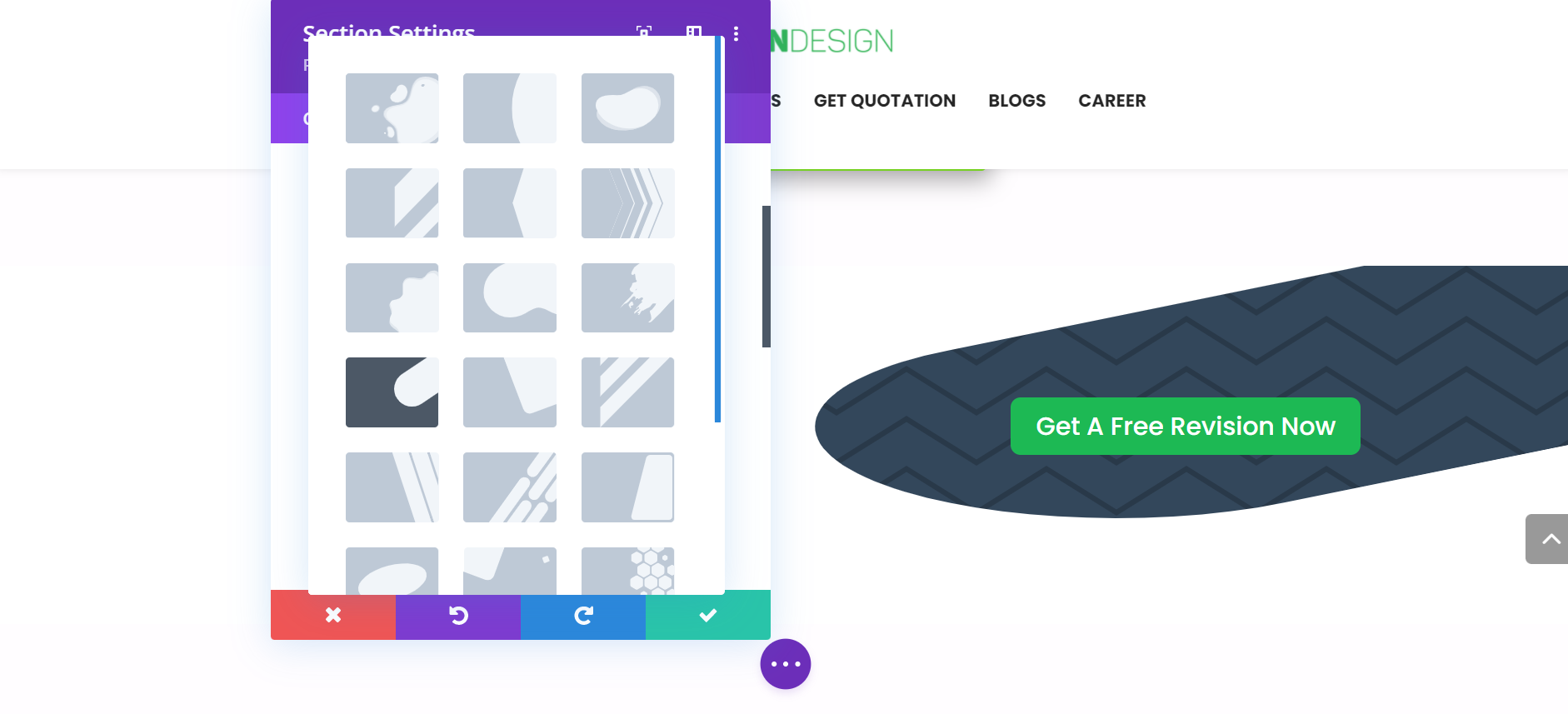
Background masks use positive and negative space to frame backgrounds and create new shapes. Background masks are placed on top of your background elements and below your content, and they work with background gradients, images, videos, and parallax images too. Masks are built using SVGs, so they are super crisp, lightweight, and will automatically conform to the size of your elements. There are more than 20 builtin background masks you can choose from.

Background Pattern

Background patterns are placed on top of your background element below your content, that emphasize your content and design. There are more than 20 builtin background patterns you can choose from.

But what if you want to upload your own SVG design patterns and masks? Well, you can not upload your custom designs yet. I hope we can have that too in later releases of Divi Theme.

For More Information:

A Quick Guide to ListView In Flutter – Hupen Design

A Quick Guide to ListView In Flutter – Hupen Design

A Quick Guide to ListView In Flutter – Hupen Design
Published At By Hupen Pun

Flutter is an open source Google’s UI toolkit for building beautiful, natively compiled applications for mobile, web, desktop, and embedded devices from a single codebase. Flutter is fast in the development process, can give native performance and can have flexible and adoptable ui components. Here, in this blog we are going to look at ListView widget in detail.

“ListView Widget comes in when you are to show a list of scrolling items on your application.”

ListView is the most commonly used scrolling widget. It displays its children one after another in the scroll direction. In the cross axis, the children are required to fill the ListView. This ListView widget will be so helpful when you are to show different widgets in a scrollable list. The list can either be in vertical or horizontal direction. All you need to do is play with some words inside the ListView widget.

There are four options for constructing a ListView: (Here, we will cover only the first three methods.)

  • The default constructor takes an explicit List<Widget> of children. This constructor is appropriate for list views with a small number of children because constructing the List requires doing work for every child that could possibly be displayed in the list view instead of just those children that are actually visible.
  • The ListView.builder constructor takes an IndexedWidgetBuilder, which builds the children on demand. This constructor is appropriate for list views with a large (or infinite) number of children because the builder is called only for those children that are actually visible. If you have long lists of items or you are creating a list dynamically, you can use this version of ListView Widget. 
  • The ListView.separated constructor takes two IndexedWidgetBuilders: itemBuilder builds child items on demand, and separatorBuilder similarly builds separator children which appear in between the child items. This constructor is appropriate for list views with a fixed number of children. This version is just the same as ListView.builder but it adds white space between each list item with the Divider widget. 
  • The ListView.custom constructor takes a SliverChildDelegate, which provides the ability to customize additional aspects of the child model. For example, a SliverChildDelegate can control the algorithm used to estimate the size of children that are not actually visible.

Let’s dive into code.

1. ListView

– It takes a children attribute with a list of items for the ListView. And those items will be widgets. Here, I have three ListTile widgets.

        ListView(
          children: [
            ListTile(
              leading: Icon(Icons.arrow_right),
              title: Text("January"),
            ),
            ListTile(
              leading: Icon(Icons.arrow_right),
              title: Text("February"),
            ),
            ListTile(
              leading: Icon(Icons.arrow_right),
              title: Text("March"),
            ),
         ),
         ],

Output Looks like This:

2. ListView.builder

– It will have an itemCount attribute, which tells ListView how many items will be in the ListView. Additionally, it will have an itemBuilder function with BuildContext and iterator and returns a Widget. Here, the itemBuilder is returning a ListTile widget.

            List months = ['January', 'February', 'March', 'April', 'May'];
                        
            ListView.builder(
              itemCount: months.length,
              itemBuilder: (BuildContext context, index) {
                return ListTile(
                  leading: Icon(Icons.arrow_right),
                  title: Text(months[index]),
                );
              },
            ),

Output Looks like This:

3. ListView.separated

-It is very similar to the ListView.builder but it will insert some widget like Divider (in this example) as a separator between each of the items. The separating widget will be in the separatorBuilder function.

            List months = ['January', 'February', 'March', 'April', 'May'];
                        
            ListView.separated(         
              itemCount: months.length,
              separatorBuilder: (BuildContext context, int index) =>
                  const Divider(
                color: Colors.blue,
              ),
              itemBuilder: (BuildContext context, index) {
                return ListTile(
                  leading: Icon(Icons.arrow_right),
                  title: Text(months[index]),
                );
              },
            ),

Output Looks like This:

Let’s have more control over the ListView widget.

  • You can make your List scroll vertical or horizontal with the following command.
scrollDirection: Axis.horizontal,
scrollDirection: Axit.vertical,
  • If you want to just reverse your list.
reverse: true,
  • If you want to adjust physics on your list.
physics: NeverScrollableScrollPhysics(),
  • If you want to keep the list items alive when they are off screen.
addAutomaticKeepAlives: false,

You can have in detail information on the ListView widget in this official Flutter Widget Of The Week from Google Flutter Team.