A Quick Guide To Snack Bar In Flutter – Hupen Design

A Quick Guide To Snack Bar In Flutter – Hupen Design

A Quick Guide To Snack Bar In Flutter – Hupen Design
Published At By Hupen Pun

Snackbars are a lightweight and convenient way to provide feedback to users in Flutter. They are short messages that appear at the bottom of the screen and disappear automatically after a short duration. Snackbars are used to show short, non-interruptive, and temporary messages.

To create a snackbar in Flutter, you need to import the Scaffold widget from the flutter material library and use the Scaffold.of method to access the nearest scaffold in the widget tree.

Here’s how you can create a basic snackbar in Flutter:

void showSnackbar(BuildContext context, String message) {
  Scaffold.of(context).showSnackBar(
    SnackBar(
      content: Text(message),
    ),
  );
}

In this code, we import the Material library and then create a function named showSnackbar that takes in a BuildContext and a String message as its parameters. In the function body, we use the Scaffold.of method to access the nearest scaffold and call the showSnackBar method on it. We pass in a SnackBar widget that contains a Text widget with the message passed in as its content.

You can call this function anywhere in your Flutter code to show a snackbar with the given message.

The SnackBar widget also accepts a few optional properties, such as:

The SnackBar widget also accepts a few optional properties, such as:

  • duration: The amount of time the snackbar should be displayed on the screen before disappearing.
  • backgroundColor: The background color of the snackbar.
  • action: A button that the user can press to take an action related to the snackbar message.

Here’s an example of how to use these properties:

Scaffold.of(context).showSnackBar(
  SnackBar(
    duration: Duration(seconds: 2),
    backgroundColor: Colors.blue,
    content: Text(message),
    action: SnackBarAction(
      label: 'Undo',
      onPressed: () {
        // Do something when the user presses the undo button
      },
    ),
  ),
);

In this example, we set the duration to 2 seconds, the backgroundColor to blue, and include an action with a label of “Undo” and an onPressed callback that will be triggered when the user presses the undo button.

Snackbars are a great way to provide feedback to users in a non-intrusive manner. They are easy to implement and customize, making them a popular choice for many Flutter developers.

You can have in detail information on the SnackBar widget in this official Flutter Widget Of The Week from Google Flutter Team.

A Quick Guide To Dialog Box In Flutter – Hupen Design

A Quick Guide To Dialog Box In Flutter – Hupen Design

A Quick Guide To Dialog Box In Flutter – Hupen Design
Published At By Hupen Pun

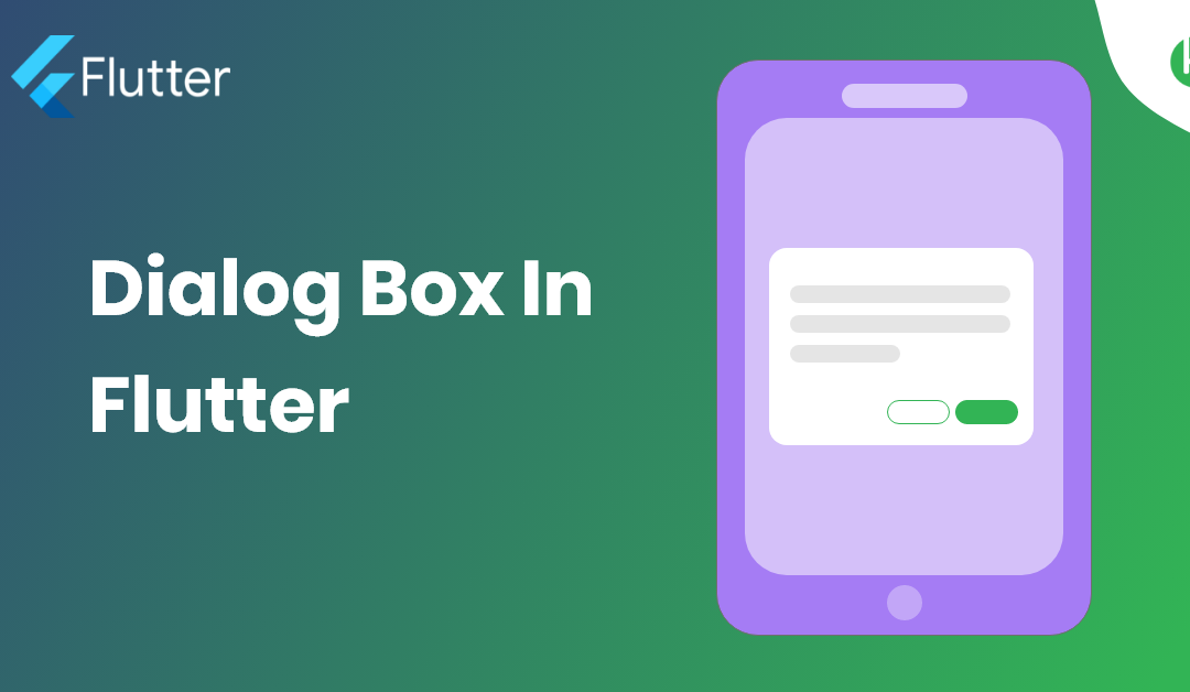
Dialog Box is a commonly used UI component in Flutter that is used to display important information or prompts to the user. It is a pop-up window that appears on top of the current screen and requires the user to take some action. In this blog post, we will explore the basics of using AlertDialog in Flutter and show you how to create and customize it for your app.

The first step in creating an AlertDialog in Flutter is to call the showDialog function, which takes a context argument and a builder function that returns the AlertDialog widget. For example:

showDialog(
  context: context,
  builder: (BuildContext context) {
    return AlertDialog(
      title: Text('Alert Dialog Title'),
      content: Text('This is the content of the alert dialog'),
      actions: [
        FlatButton(
          child: Text('OK'),
          onPressed: () {
            Navigator.of(context).pop();
          },
        ),
      ],
    );
  },
);

In the above example, we are creating an AlertDialog with a title, content, and an action. The actions property is used to specify the buttons that will be displayed at the bottom of the alert dialog. You can add as many actions as you like, but it is recommended to limit the number of actions to two.

You can also customize the appearance of the AlertDialog by changing its title, content, backgroundColor, and other properties. For example:

AlertDialog(
  title: Text('Alert Dialog Title'),
  content: Text('This is the content of the alert dialog'),
  backgroundColor: Colors.blue,
  shape: RoundedRectangleBorder(
    borderRadius: BorderRadius.circular(10.0),
  ),
  actions: [
    FlatButton(
      child: Text('OK'),
      onPressed: () {
        Navigator.of(context).pop();
      },
    ),
  ],
);

In the above example, we are changing the background color of the AlertDialog to blue and giving it a rounded rectangle border with a 10.0 radius.

In conclusion, AlertDialog is a useful UI component in Flutter that allows you to display important information or prompts to the user. With the ability to customize its appearance and behavior, it makes it a great option for creating engaging and interactive experiences in your app.

You can have in detail information on the GridView widget in this official Flutter Widget Of The Week from Google Flutter Team.
Background Mask And Background Pattern For Divi

Background Mask And Background Pattern For Divi

Background Mask And Background Pattern For Divi
Published At By Hupen Pun

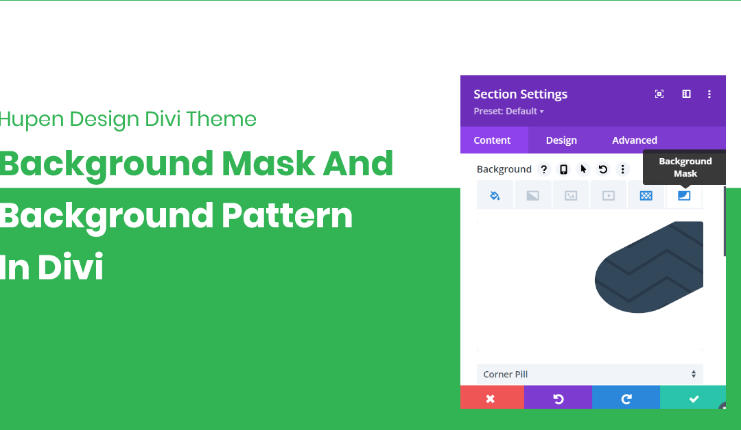
Divi is the most popular visual drag and drop website builder for WordPress. It is developed and maintained by Elegant Themes. With Divi, you can build beautiful, powerful, and eye-catching websites. With the version of 4.15.0 Divi has brought the most powerful features like Background Pattern and Background Mask. These two brand new design settings allow you to create a vast array of new visual effects by combining colors, images, gradients, masks, and patterns using a simple new interface.

Background Mask

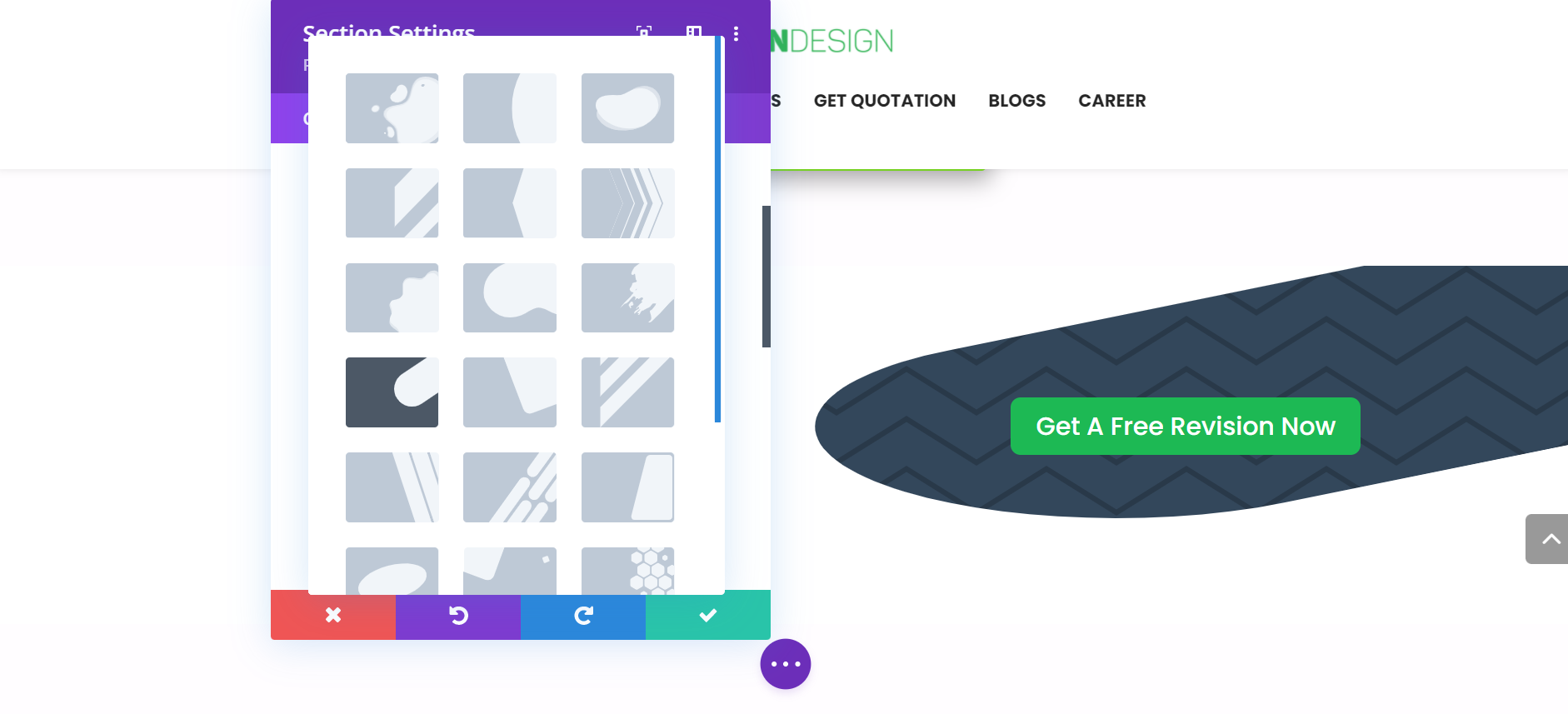
Background masks use positive and negative space to frame backgrounds and create new shapes. Background masks are placed on top of your background elements and below your content, and they work with background gradients, images, videos, and parallax images too. Masks are built using SVGs, so they are super crisp, lightweight, and will automatically conform to the size of your elements. There are more than 20 builtin background masks you can choose from.

Background Pattern

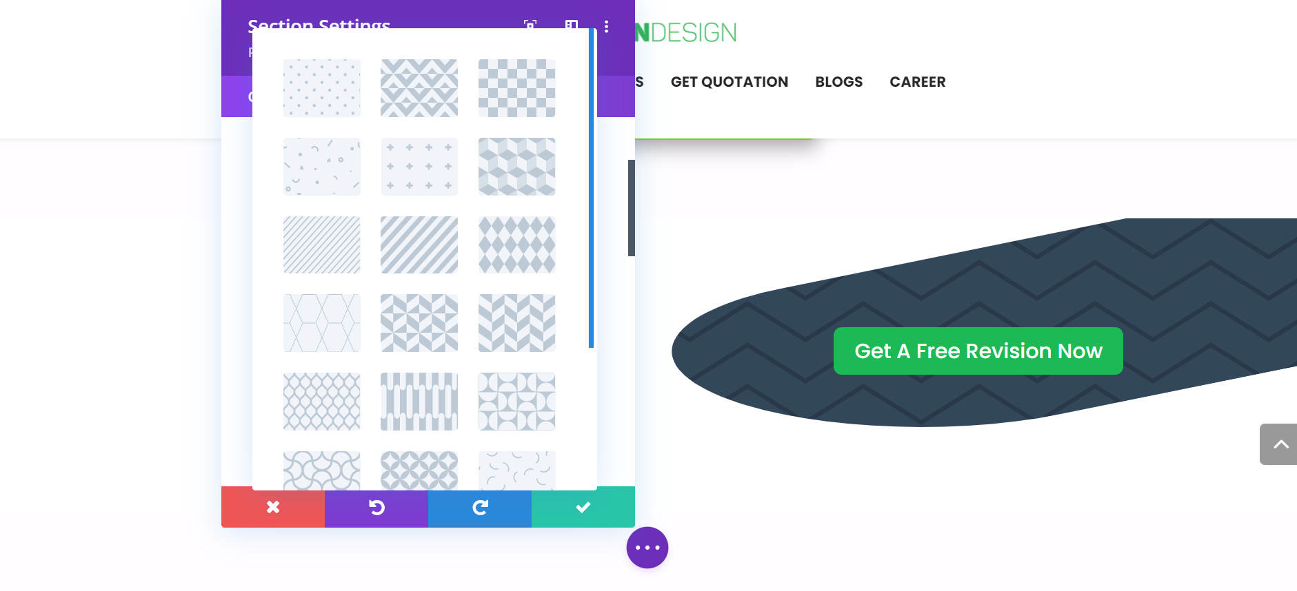
Background patterns are placed on top of your background element below your content, that emphasize your content and design. There are more than 20 builtin background patterns you can choose from.

But what if you want to upload your own SVG design patterns and masks? Well, you can not upload your custom designs yet. I hope we can have that too in later releases of Divi Theme.

For More Information:

New Teaching License Syllabus For Secondary And Lower Secondary Levels: TSC

New Teaching License Syllabus For Secondary And Lower Secondary Levels: TSC

New Teaching License Syllabus For Secondary And Lower Secondary Levels: TSC
Published At By Hupen Pun

The Teachers Service Commission (TSC) [Ne: शिक्षक सेवा आयोग ] has published a new syllabus for Teaching License for the Secondary (Ma. Bi.) and Lower Secondary Level(Ni. Ma. Bi.). The chairman desk was vacant for so long time so, there were no new improvements over TSC. But, now the new chairman Mr. Madhu Prashad Regmi has been in the position of chairman.

This course is designed for those who want to become teachers at different levels. The curriculum has been developed for the purpose of conducting a teaching permit examination for those who wish to integrate themselves into the state of school education and teaching-learning system in Nepal before entering the teaching service.

Get the Syllabus:

1. Secondary Level (Ma. Bi. / मा. बि.) Teaching   License Syllabus

2. Secondary Level (Ma. Bi. / मा. बि.) Teaching   License Syllabus

For More Information: